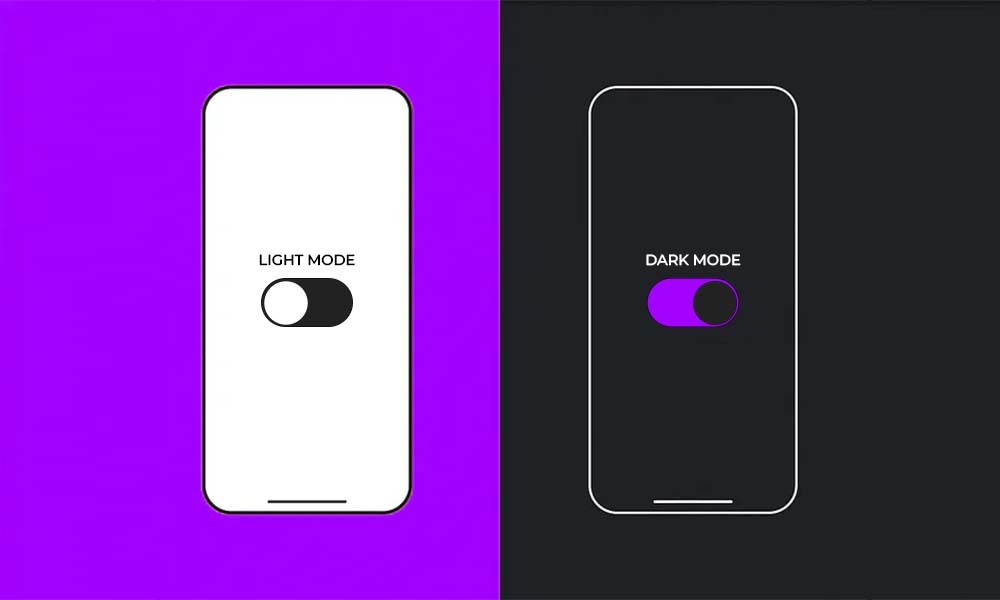
Let’s talk about one of the most heated design debates of our time: dark mode versus light mode. It’s just like the pineapple on pizza combo – people have strong opinions, and nobody seems to agree.
And this isn’t just about aesthetics…
Some swear dark mode is easier on the eyes. Others claim light mode is more readable. And then there are those who switch back and forth depending on the time of day or their mood.
But the real question is, what do users actually prefer? And more importantly, which one performs better for your app?
Turns out, it’s not just about personal taste. There’s real science and data behind why people lean one way or the other, so let’s settle this once and for all with facts, not feelings.
Why This Debate Even Matters
Before we dive into preferences, let’s talk about why this decision is more than just a design trend.
Dark mode isn’t just cool-looking. It reduces eye strain in low light, so no more blinding white screens at 2 AM. It can also save battery life on OLED screens – black pixels are literally turned off, and it feels more premium and modern
While light mode isn’t about being old school, it gives better readability in daylight. Try reading black text on white paper outside, plus it feels familiar and clean because our brains are trained for dark text on light backgrounds.
And… some apps just look better in light – ever tried using Google Docs in dark mode? It’s weird.
So, which one should you use? Let’s look at the data.
What the Research Says About User Preferences
1. Most People Say They Prefer Dark Mode… But Do They Actually Use It?
A 2022 study found that over 80% of users claim to prefer dark mode when asked, but the actual usage data tells a different story.
Only about 35-40% of users keep dark mode on permanently. The rest either use light mode by default, switch based on time of day (auto-toggling at night), or they just forget that dark mode exists and never change the setting.
People like the idea of dark mode more than they actually use it…
2. Dark Mode Wins for Media Consumption But Not for Productivity
Dark mode dominates entertainment apps like YouTube, Netflix, and Spotify. For reading apps like Kindle and Medium, people have split preferences, but light mode often wins. As for productivity apps like Google Docs and Notion, light mode still rules.
Why? Because reading long-form text in dark mode can be harder on the eyes, especially in well-lit environments.
3. Age and Demographics Play a Role
- Younger users, Gen Z/Millennials, lean toward dark mode.
- Older users, Gen X/Boomers, often stick with light mode.
- Gamers and night owls almost always prefer dark.
Fun fact: Men are slightly more likely to use dark mode than women.
The Performance Factor – Which Mode Actually Works Better?
Preference is one thing, but what about usability, engagement, and conversions?
1. Dark Mode Can Increase Engagement For the Right Apps
Social media apps like Twitter, Reddit, and Instagram see longer session times in dark mode, while video and music apps keep users longer with dark interfaces.
Why? Because dark backgrounds make content pop, reducing distractions.
- Light Mode Still Wins for Readability for Text-Heavy Apps
News sites, blogs, and e-readers perform better in light mode, and e-commerce sites often see higher conversions with light interfaces.
Why? Because our brains process dark text on light backgrounds faster. Thanks, centuries of printed books.
3. Battery Life Matters, But Only for OLED Screens
If your app is used mostly on OLED iPhones or Android devices, dark mode can extend battery life, sometimes by up to 30%.
But on LCD screens? Zero difference.
The Best Solution
Since preferences are split, the smartest move is to offer both and make switching easy.
How to Implement Dark Mode the Right Way
- Auto-toggle based on system settings (iOS/Android both allow this).
- Include a manual toggle in your app settings, don’t hide it.
- Test both versions. A/B test to see which performs better for YOUR users.
If you force one mode, you’ll annoy half your audience. Choice is key.
Conclusion
Use dark mode if your app is media-heavy, used mostly at night, and aimed at younger audiences.
And use light mode if your app is text-heavy, used in daylight, and targeting older or less techy users.
But the best option for most apps is to give users the choice because in the end, the best design is the one that lets people use your app the way they want to.
Need Help Optimizing Your App’s Design?
At The Apptitude, we help developers make data-driven design decisions, so your app looks and performs its best. Contact us at (512) 885-0379 or email us at info@theapptitude.com to schedule a free consultation.